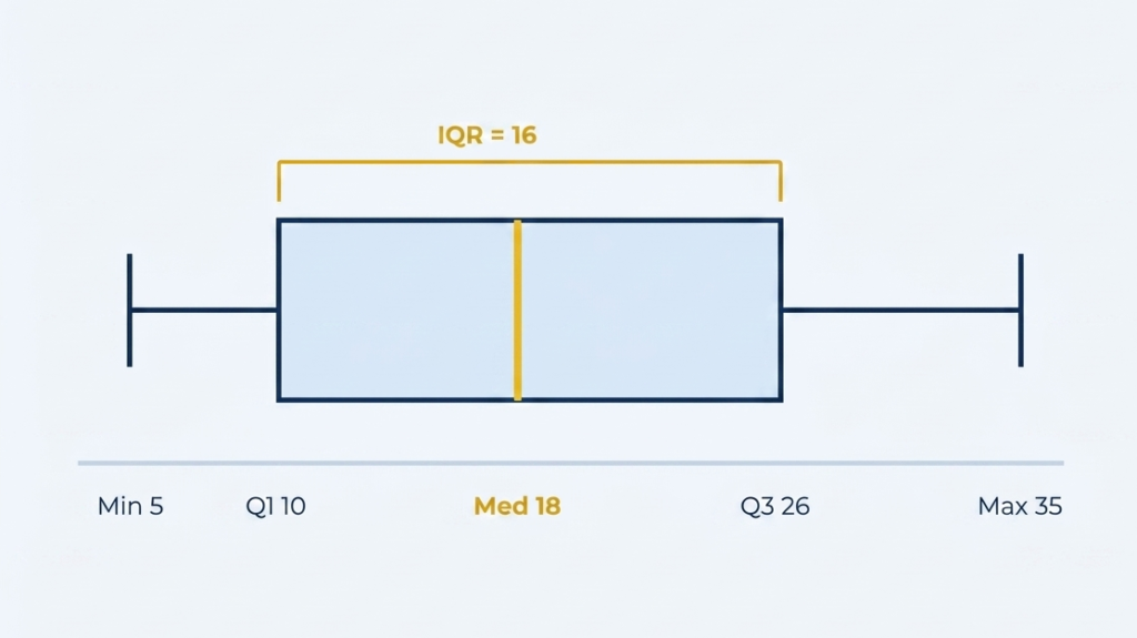
box plot (also called a box-and-whisker plot) is a graph that displays the distribution of a data set using five values: the minimumQ1 (first quartile), median (Q2)Q3 (third quartile), and maximum. The box spans from Q1 to Q3, and the line inside the box marks the median. The IQR = Q3 − Q1 measures the spread of the middle 50% of the data. Box plots appear on Florida FSA statistics standards (MAFS.912.S-ID) and the SAT Math “Problem Solving & Data Analysis” section.

"Box Plot" Explained

A distribution of medians.

Box Plot — How to Read, Make & Interpret One

Formal definition: A box plot — also called a box-and-whisker plot — is a standardized graphical display of a data set’s distribution based on its five-number summary: minimum, Q1 (first quartile), median, Q3 (third quartile), and maximum. The “box” spans from Q1 to Q3, showing where the middle 50% of data points fall. The “whiskers” extend from the box to the minimum and maximum values (excluding outliers). A vertical line inside the box marks the median. Box plots allow rapid visual comparison of center, spread, and skewness across data sets.

box plot

Where you’ll see it: Box plots appear in Florida MAFS.912.S-ID.1 and MAFS.912.S-ID.2 standards, FSA Algebra 1 and Statistics assessments, SAT Math “Problem Solving & Data Analysis” domain (1–2 questions per test), AP Statistics, and ACT Mathematics.

Parts of a Box Plot — Anatomy Diagram

Min
= 5
5
Q1
= 10
10
Median
(Q2 = 18)
Q3
= 26
26
Max
= 35
35
IQR = Q3 – Q1 = 26 – 10 = 16
The box plot above uses the data set {5, 10, 18, 26, 35}. Each labeled component corresponds to one value in the five-number summary — the foundation of every box plot problem on the SAT and Florida FSA.
COMPONENT WHAT IT IS IN THE DIAGRAM ABOVE SAT/FSA USE
Minimum The smallest value in the data set (excluding outliers) Left whisker endpoint = 5 Range calculation: Max – Min
Q1 (First Quartile) The median of the lower half of the data — 25% of data falls below this Left edge of box = 10 IQR calculation, outlier detection
Median (Q2) The middle value — 50% of data falls below, 50% above Line inside box = 18 Center comparison between box plots
Q3 (Third Quartile) The median of the upper half of the data — 75% of data falls below Right edge of box = 26 IQR calculation, outlier detection
Maximum The largest value in the data set (excluding outliers) Right whisker endpoint = 35 Range: Max – Min = 35 – 5 = 30
IQR Q3 – Q1 = the span of the box = the range of the middle 50% Q3 – Q1 = 26 – 10 = 16 Spread comparison, outlier detection

Five-Number Summary, IQR & Outlier Detection

Min MINIMUM
Q1 1ST QUARTILE · 25TH %ILE
Q2 MEDIAN · 50TH %ILE
Q3 3RD QUARTILE · 75TH %ILE
Max MAXIMUM

Every box plot problem on the SAT or Florida FSA requires one or more of these three calculations. The five-number summary builds the plot. The IQR measures its spread. The outlier formula determines which data points fall outside the whiskers.

📋 FIVE-NUMBER SUMMARY
Min Q1 Median Q3 Max

How to find each:

  1. Order the data from least to greatest.
  2. Min = first value • Max = last value.
  3. Median (Q2) = middle value (or average of two middle values).
  4. Q1 = median of the lower half (below Q2).
  5. Q3 = median of the upper half (above Q2).
Key: Q2 is the median – not the mean/average.
✏️ INTERQUARTILE RANGE (IQR)
IQR = Q3 – Q1

The IQR is the width of the box – it measures the spread of the middle 50% of the data.

A large IQR → data is spread out (high variability).

A small IQR → data is clustered (low variability).

SAT questions frequently ask you to compare IQRs between two box plots – the wider box has the larger IQR.

IQR ≠ range. Range = Max – Min (includes all data).

⚠️ OUTLIER DETECTION – THE 1.5 × IQR RULE
Outlier if: x < Q1 – 1.5(IQR) OR x > Q3 + 1.5(IQR)

A data point is an outlier if it falls below the lower fence or above the upper fence:

  • Lower fence = Q1 – 1.5 × IQR
  • Upper fence = Q3 + 1.5 × IQR

Outliers are plotted as individual dots beyond the whiskers – the whiskers stop at the last non-outlier value.

SAT Hard questions: "Which value, if added to the data set, would be classified as an outlier?" – calculate both fences first, then test each answer choice.

This rule is NOT given on the SAT reference sheet – it must be memorized.

How to Make a Box Plot — 6 Steps

Follow these steps in order. A common error is skipping Step 1 (ordering the data) — if the data is unordered, every subsequent step produces the wrong quartile values.

# STEP COMMON ERROR
1 Order the data from least to greatest. Every calculation below depends on the data being sorted. Skipping this step and finding quartiles from unsorted data – the most common construction error.
2 Find Min and Max. These become the endpoints of the whiskers (unless outliers are present). Using the first and last value from the original unsorted list instead of the sorted list.
3 Find the Median (Q2). If odd count: the middle value. If even count: the average of the two middle values. Confusing median with mean. The median is positional – always count from both ends to find the center.
4 Find Q1. The median of the data values below (not including) Q2. Including Q2 in the lower half when the data count is odd – Q2 is excluded from both halves.
5 Find Q3. The median of the data values above (not including) Q2. Same error as Step 4 on the upper half. Q2 is never part of the Q1 or Q3 calculation.
6 Draw the plot. Draw a number line → mark Min, Q1, Median, Q3, Max → draw a box from Q1 to Q3 → draw a vertical line at Median → extend whiskers from Q1 to Min and from Q3 to Max. Drawing whiskers from the center of the box (the median) instead of from the edges (Q1 and Q3).

Box Plot Problems — 2 Worked Examples

Example 1 – Reading a Box Plot Easy

A box plot has the following values: Min = 12, Q1 = 20, Median = 28, Q3 = 35, Max = 50. Find (a) the IQR, (b) the range, and (c) the percentage of data between Q1 and Q3.

Step 1: IQR = Q3 − Q1 = 35 − 20 = 15
Step 2: Range = Max − Min = 50 − 12 = 38
Step 3: By definition, the box (Q1 to Q3) always contains exactly 50% of the data – this is true for every box plot, regardless of the actual values.
SAT note: "what percentage of the data falls between Q1 and Q3?" always equals 50% – it is a definition, not a calculation. Students who try to calculate this waste 90 seconds.
Answer: IQR = 15 · Range = 38 · Q1 to Q3 always contains exactly 50% of data
Example 2 – Comparing Two Box Plots (SAT Level) Hard - SAT Level

Class A has a box plot with Q1 = 60, Median = 72, Q3 = 85. Class B has Q1 = 55, Median = 68, Q3 = 80. Which class has greater variability in scores? Which class performed better overall?

Step 1: Calculate IQR for each → Class A: 85 − 60 = 25 · Class B: 80 − 55 = 25
Step 2: Compare spread → IQRs are equal (25) → both classes have the same variability in the middle 50%
Step 3: Compare center (median) → Class A median = 72 · Class B median = 68 → Class A performed better overall
Step 4: Compare position → All three quartile values (Q1, Median, Q3) are higher for Class A → Class A's distribution is shifted upward
SAT trap: students choose the class with the higher Max as "better" – the SAT compares using medians and IQRs, not maximum values. The maximum is one data point; the median represents the typical performance.
Answer: Equal variability (IQR = 25 for both) · Class A performed better (higher median of 72 vs. 68) · Compare box plots using MEDIAN for center and IQR for spread – never max values

How Box Plots Appear on the SAT Math Section

Box plots are tested in the SAT Math section under the “Problem Solving & Data Analysis” domain — the domain that accounts for approximately 17 of the 58 questions on the full SAT Math test. This domain is the most under-prepared section for most students because it requires data interpretation skills, not just formula recall. Box plot questions (1–2 per test) consistently appear at Medium–Hard difficulty because students who can calculate IQR still cannot correctly compare two box plots or identify outliers under time pressure. Florida student-athletes targeting NCAA eligibility or the Bright Futures Scholarship Academic Scholars threshold (1290+ SAT) often leave 3–5 entire data analysis questions blank — an avoidable loss of 30–50 SAT Math points.

BOX PLOT QUESTION TYPE SAT FREQUENCY DIFFICULTY
Read five-number summary from a box plot 1 per test Easy–Medium
Calculate IQR from a given box plot 1 per test Medium
Compare median or IQR of two box plots 1 per test Medium–Hard
Determine if a value is an outlier (1.5×IQR rule) 1 per 2 tests Hard
Interpret box plot skewness (left vs. right skew) 1 per 2 tests Hard

4 Box Plot Mistakes Students Make on the SAT & FSA

Mistake 1: Confusing the median with the mean. The median (Q2) in a box plot is the middle value of the sorted data — it is NOT the average. The mean (average) is calculated by summing all values and dividing by count. A box plot tells you nothing about the mean — only the median. On the SAT, answer choices that reference “the average” cannot be read from a box plot diagram. Fix: on any box plot problem, immediately replace the word “median” with “middle value” in your thinking — not “average.” If a question asks about the mean, you need actual data values, not just the box plot.
Mistake 2: Thinking the whiskers show frequency — they don’t. The length of a whisker tells you the range of values in that quarter of the data, not how many data points are there. A long left whisker does NOT mean many data points are in the lower range — it means those points are spread farther apart. Every quarter (Min to Q1, Q1 to Q2, Q2 to Q3, Q3 to Max) contains exactly 25% of the data regardless of how long or short the whisker is. Fix: repeat to yourself before every box plot problem: “box plot shows WHERE data is spread, not HOW MANY data points are in each section.” Each quarter of the box plot always contains the same percentage (25%) of the data.
Mistake 3: Calculating IQR as Max − Min (the range) instead of Q3 − Q1. Range and IQR are two different measures. Range = Max − Min (the full spread of all data). IQR = Q3 − Q1 (the spread of the middle 50%). Students who mix these up get the wrong value on both calculations. Fix: IQR = “box width” — the width of the rectangular box on the plot. Range = “whisker to whisker” — the full distance from the left whisker tip to the right whisker tip. Visualizing the diagram from Block 02 above instantly distinguishes the two. InLighten’s certified math tutors in Orlando use diagram-based memory techniques like this in every statistics session.
Mistake 4: Including Q2 in the Q1 or Q3 calculation. When finding Q1, you use only the data values that fall strictly below the median (Q2). When finding Q3, you use only the values strictly above Q2. The median itself is excluded from both halves — always. Students who include Q2 in one of the halves shift their quartile values and get a systematically wrong IQR. Fix: after finding the median, physically cross it out in your written work before finding Q1 and Q3. This enforces the exclusion rule visually. For even-count data sets where the median is the average of two middle values, cross out both of those middle values before splitting into halves.

Practice Problems — Box Plot

Frequently Asked Questions — Box Plot in Math

A box plot — also called a box-and-whisker plot — is a graphical display that summarizes a data set using five key values: the minimum, Q1 (first quartile), median (Q2), Q3 (third quartile), and maximum. The rectangular “box” spans from Q1 to Q3, with a vertical line marking the median. “Whiskers” extend from the box to the minimum and maximum values (excluding outliers). Box plots allow quick visual comparison of center (median), spread (IQR), and distribution shape across data sets. They appear in Florida MAFS.912.S-ID standards and on the SAT Math “Problem Solving & Data Analysis” section.

The five-number summary consists of: (1) Minimum — the smallest value; (2) Q1 — the median of the lower half of the data; (3) Median (Q2) — the middle value of the full data set; (4) Q3 — the median of the upper half; (5) Maximum — the largest value. To find them: first sort the data from least to greatest. Then find the median, splitting the data into two halves (excluding the median itself). Find the median of each half to get Q1 and Q3. The IQR equals Q3 − Q1.

The interquartile range (IQR) = Q3 − Q1. It measures the spread of the middle 50% of the data — the width of the box in the plot. To identify outliers, apply the 1.5×IQR rule: calculate the lower fence (Q1 − 1.5×IQR) and the upper fence (Q3 + 1.5×IQR). Any data point below the lower fence or above the upper fence is an outlier, plotted as an individual dot beyond the whisker. This rule is not given on the SAT reference sheet and must be memorized for Hard-tier data analysis questions.

Box plot questions appear 1–2 times per SAT Math test, under the “Problem Solving & Data Analysis” domain — the domain that accounts for approximately 17 of 58 total SAT Math questions. Box plot questions are typically Medium–Hard difficulty because they require data interpretation, not just formula recall. Common question types include: reading the five-number summary from a given plot, calculating IQR, comparing two box plots by median or IQR, and (less frequently) applying the 1.5×IQR outlier rule. Florida students targeting Bright Futures Scholarship Academic Scholars requirements (1290+ SAT) should treat the full data analysis domain — including box plots — as a high-priority preparation area.

Yes. InLighten’s certified math tutors in Orlando specialize in SAT data analysis including box plots, five-number summaries, IQR, outlier detection, and box plot comparison — all at the level of the Florida FSA Statistics assessment and the SAT Math “Problem Solving & Data Analysis” section. We diagnose exactly which data analysis skills your student is missing before building a targeted session plan. Student-athletes working toward NCAA eligibility requirements or Florida Bright Futures Scholarship thresholds receive specialized SAT Math preparation where data analysis is a core module. Book a free math assessment to start.

Still Struggling with Box Plots or SAT Data Analysis? Work with a Certified Math Tutor in Orlando.

Understanding the five-number summary is one thing — reading a side-by-side box plot comparison under SAT time pressure and selecting the right interpretation is another. The SAT’s “Problem Solving & Data Analysis” domain (box plots, scatter plots, statistics) is the section where students most consistently leave points on the table. InLighten’s certified math tutors in Orlando diagnose exactly which data analysis skills your student is missing — IQR calculation, outlier detection, or box plot comparison — and build targeted sessions around those gaps. Student-athletes working toward NCAA eligibility or Florida Bright Futures Scholarship requirements receive a customized SAT Math plan where data analysis is treated as the high-ROI domain it is. Most students see measurable improvement in 2–3 focused sessions on data analysis alone.